Sunday, September 30, 2018

Touch Chapter - The Feeling Bubble

The Feeling Bubble by Diane Ackerman

      "Years ago, I read about a boy who had to live in a bubble (designed by Nasa) because of the weakness of his immune system and his susceptibility to disease. We are all that boy. The bubble is our skin. But the skin is also alive, breathing and excreting, shielding us from harmful rays and microbial attack, metabolizing vitamin D, insulating us from heat and cool, repairing itself when necessary, regulating blood flow, acting as a frame for our sense of touch, aiding us in sexual attraction, defining our individuality, holding all the thick red jams and jellies inside us where they belong," (page 67).

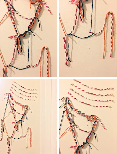
      For my response to this chapter I wanted to focus on color as the main focus for design. When the author describes the little boy who had to live in a bubble I imagined that his world was stripped of color. That's why I chose to emphasize nude colors and black in my design. I took four pictures of this image to show that it can be seen from multipe angles. I wanted to create various elements to contrast with the various elements described in the passage.


Touch Chapter - Pain

Pain by Diane Ackerman


"Heart attacks frequently produce a pain in the stomach, the left arm, or the shoulder when this happens, the brain can't figure out exactly where the message is coming from. In the classic phenomenon of phantom-limb pain, the brain gets faulty signals and continues to feel pain in a limb that has been amputated; such pain in a limb that has been amputated; such pain in a limb can be torturous, perverse, and maddening since there is nothing physically present to hurt," (page 104).

For my response to this chapter I wanted to make something that resembled pain and something that looked imcomplete. I wanted to actually create something that would poke out at the edges and be painful to touch. As you can see, in the first image of the closeup the object looks dark and in high contrast with the white wall. My goal was to make this object look crooked and out of place, just as pain can be.